
cards
Print and Play Explained in 10 Questions

Hello aspiring game designers,
The information below is a compilation of information I wish I knew 6 months ago when I began creating my first Print and Play (PnP) game. I am not a graphic designer and this is by no means a comprehensive how-to guide for creating files. It is my hope however, that this guide will help you decide when and why to design a PnP as well as help you avoid some common formatting and design pitfalls.
What the heck is a print-and-play?
A Print-and-Play is a digital file containing all the components of a board game. The file can be shared with enthusiastic players to allow them to print, assemble, and play your game without having to buy a professionally manufactured version.
But I am trying to sell my game, why would I want to let others play my game without giving me money?
There are several reasons for game designers and publishers to use a PnP:
- Make additional money
Selling a PnP copy of your game online for a fraction of a retail copy is a way to make money from consumers unwilling or unable to purchase a manufactured copy of the game.* When pricing a PnP, prices are typically low given that customers pay additional costs printing the game. PnP games rarely sell for more than $5 (excluding pen and paper RPG games), but it is still money that you may not otherwise have.
- Obtaining Kickstarter/Crowdfunding Pledges
If you are running a crowdfunding campaign for your game, a low level pledge offering a PnP can be a great way to generate pledges. More backers is always a good thing and a PnP is a great way to get people to commit to your campaign and still feel they are receiving a reward without having to worry about shipping a physical object. With all the momentum and excitement of the campaign, they may even bump their pledge levels as the campaign progresses. From my observations, most reward levels for a PnP are between $1 and $5.
- Promoting a game
Giving away your PnP for free can be a great promotional tool. Offering the file to reviewers, distributors, publishers, and even the general public can pique their interest and gain support for your project. Offering a PnP also builds credibility as a new game designer, showing the world that you have taken steps to make the game and are not just showcasing the ideas on a napkin.
Debate exists over whether giving out free copies of the PnP will hinder or enhance your sales. I personally cannot speak to this as I did not provide a free version of my PnP, but I recommend that you read James Mathe’s in-depth analysis of the impact giving away a free PnP had on his Kickstarter as well as the counterpoints offered in the comments of his article.
Finally, you have the option of giving away an incomplete version of the PnP for free and offering a finished or higher resolution version as a Kickstarter reward or online sale. That is not to say the free version is unplayable, just that it is missing some artwork or has been formatted in black and white or low resolution. For an example of this, Teale Fristoe offered up both a free and purchasable version for his Kickstarter: Birds of a Feather.
Now you’ve got me excited to make a Print-and-Play. How do I make one?
Now we enter the nitty-gritty of design. Like all creative endeavours, there is no end to debate over best practices. The formatting strategies below are based on my experience creating a PnP for my Kickstarter campaign and the copious amount of trial and error that ensued. Though admittedly, I did not implement all of the strategies listed below. If I create another PnP, this is the information I’d want to know.
What format to use?
I prefer a PDF file. It protects the files from being tampered with and more importantly, maintains the proportions of the images when printing. Users will require Adobe PDF reader to access the file, but it is free and available here. Microsoft Word and Adobe Photoshop both allow for the creation of PDF files and both offer free trials to assist you in creating the files. The majority of print shops are capable of reading and modifying adobe files. If they do not have the software, this would be a big red flag for me to print the game elsewhere.
Another strategy is to save the rules and each component as separate files for faster loading. While I do advocate having your game rules posted online as a separate file, I find creating a separate file for each component creates issues for some printers attempting to print double-sided pages across multiple files simultaneously. Keep all of the components together for easier printing.
When posting the rules online, have the text for the rulebook portion of the PnP formatted into a single column so that smartphones and tablets can simply scroll up and down to access all of the materials. Of course, users will not necessarily be accessing the PnP regularly on their phones, but to quickly check rules, the single column of text is very helpful.
What type of Paper?
Two topics are included here, the first being the type of paper/materials gamers will use to print your game. Paper quality is a decision that players need to make and will be determined by the quality of PnP they are looking to produce. I recommend throwing novice game printers a bone by including a recommended GSM or the components used in the final game version of the game.
The second issue has to do with the fact that the dimensions of printer paper are different around the world. In North America, US letter is the standard size and measures 215.9mm x 279mm (8.5” x 11”). Many other countries use A4 paper measuring 210 x 279 mm (8.27” x 11.69”)
What it boils down to is that US Letter is wider and A4 is longer.
When making a PnP, ensure that your game fits the smaller dimensions of both formats, with the width of A4 and the length of US Letter. That way, the PnP will not have its portions distorted or cut-off regardless of whether it is printed on A4 or US Letter. This uses more paper, but will satisfy most audiences and avoids having to create multiple versions of the PnP.
What about Ink?
A full-colour version of the PnP is a must to show off your game in all its glory, but many price conscious players will look for ways to save money. Some game designers offer a black and white, low ink version to reduce the cost of printing. Designers may even remove all the artwork and just leave the bare bones essentials to reduce cost. A stripped down version is a good way to ensure a wide price gap between the PnP and the retail version, particularly if your game has a low retail cost to begin with.
How about resolution?
When it comes to resolution (how detailed the images are based on the number of dots per inch), the community is split. Supporters of a low resolution PnP (around 150 DPI) state that many printers can’t produce a noticeable difference in quality at higher DPI level and that the file sizes are much smaller. Supporters of higher resolution files (300 DPI) argue it looks nicer and that file size does not matter. The jury is still out on this one, so you will have to make a choice. Of course, if you have the time you can also offer both formats, such as a low resolution version for free and then a high resolution version at a cost or a Kickstarter pledge.
Cool, so how do arrange the images…I always hated Rubik’s cubes?
If possible, have a digital designer do this for you. I was fortunate enough to have a digital designer with a history in print layout, so he just went to town.
If you happen to be a one man/woman show or just don’t have a digital designer, grab yourself a trial version of an image editing software such as Adobe Photoshop/Illustrator/InDesign and remember the following principles:
- Keep all cards flush against one another. Leave no blank space in between as this will reduce the number of cuts you have to make. Also, be sure to leave some bleed room around where the cuts are supposed to be made. Bleed room is a space where the background image is consistent and does not change (such as a solid colour or a continuous pattern), which helps to hide any imperfect cuts.

Note the shared colour and pattern reduces the visibility of imperfect cuts between the indicator markings on the side - Place the backs of cards/components on the next page of the PnP. I prefer having them formatted for duplex printing, though from speaking with designers there will always be someone whose printer is unable to print the components properly. I stuck with duplex printing, but if your audience is up in arms, another printer layout may be appropriate.
- Keep the cuts for all components square/rectangular whenever possible, even if the manufactured version of the game offers alternative shapes. Cutting anything other than a straight line consistently requires special equipment sold at craft stores or the ability to wield scissors with the steadiness of a member of the bomb squad. Make it easy for players and avoid irregularly shaped components whenever possible.
- Avoid placing cut lines across the page. Full or even dotted indicator lines highlight imperfect cuts by showcasing little bits of line on the sides of game components. Instead, use short indicator lines along the page edges for players to line up their cuts. If players really want cut lines, they can use a ruler and draw a line between the indicator marks.

Some argue for indicator lines around oddly shaped components, but as mentioned above, it is better to keep components square whenever possible. The only situation where indicator lines are necessary are if you are trying to save space and cram different game components onto the same page, making the edge indicators interfere with one another. In this case, cut lines are necessary, but make sure that the line colour does not blend in with the components (I recommend black or white depending on the component’s colour)

Great, I made my Print and Play; now how do I distribute it?
There are lots of ways to distribute a PnP while still limiting access to only certain users. If you are looking to sell the file, there are numerous online stores that are available if you don’t feel like hosting the file yourself. Two popular examples are the War Game Vault and The Game Crafter, though certainly other outlets exist. The appeal of these sites is that they shoulder the hosting cost and offer a turn-key solution as well as exposure in exchange for a portion of the sales.
If you are looking to upload and distribute the file yourself, Drop Box and Google Drive are both popular avenues that allow you to share the PnP through a link. I personally prefer Google Drive as it does not require a login like Drop Box, but for my Kickstarter I offered the PnP through both so supporters had their choice.
How did you learn all this?
Lots of trial and error, discussions with my digital designer Daniel Prairie and a supportive online community. Thank you for the feedback from Board Game Geek and this Facebook community of game designers.
Additional readings
*There is debate in the industry over whether selling PnP games will reduce retail sales, but I have yet to find a comprehensive survey of the industry on the overall impact offering a PnP has on final sales numbers.
Developer Diary: Card Design and Format
 What follows is a not so concise summary of our card design up to this point. Please note that the Apples card is in the process of having the image itself revamped. The Posterizing filter left some unsightly colors and pronounced gradient lines on the card image that will be altered in the final version. The focus of this designer diary is to discuss the changes the layout, frame, and text have underwent in the development of Crop Cycle’s cards.
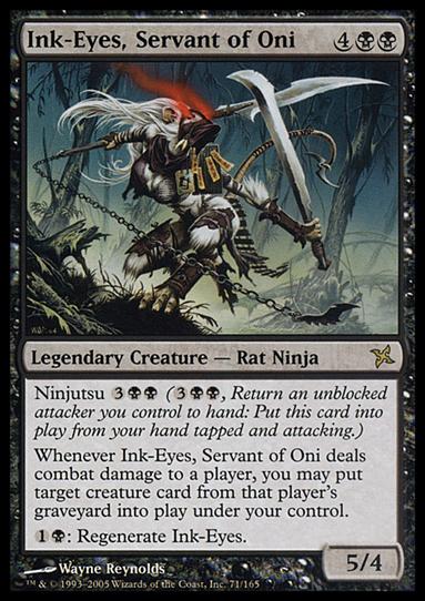
When it comes to designing cards, many games follow a template commonly associated with Magic: The Gathering. The format separates text from the image and focuses on highlighting the text with an opaque box.

The reason for the popularity of this format is that it works; textboxes ensures the text remains clear and distinct. The textbox can be entirely separate from the image or as a translucent textbox as pictured in the Shadowrun card below. In both cases, the effect is that your rules are highlighted and legible on the playing card.

For the earliest design of the Crop Cycle cards, this layout was what we intended. As you can see from the image below, the initial Crop Cycle card followed the template of the Magic card, with important information included at the top as we as the bottom half of the card while the image was intended to be placed in the middle.

The trouble with this format is that it reduces the real-estate on the card for the image itself. Regardless of whether the textbox is entirely separate from the image or placed in a translucent textbox over the image, the result is reduced space on the card for the image.
At this point, my digital designer and I sat down and began to brainstorm alternative design solutions. An important aspect of Crop Cycle is showcasing agriculture, with the vast majority of the photos taken locally throughout our home province of Manitoba. Though I understand the effectiveness of textboxes and accept that Magic is able to make their images work through design decisions given the space constraints of their card format, I wanted to focus on showing as much of the picture as possible.
Several weeks of research, debate, and caffeine consumption later, we came up with a full-card layout.

As you can see, the first version of the cards presented a number of challenges. After looking it, we noticed some pretty hefty design problems. The use of season symbols to indicate when to play the crop cards were a good way to reduce text, but failed to stand out against the background. Furthermore, the text was far to small and the lacked any sort of effects to differentiate them from the picture.
Clearly we had plenty of work to do.

The 3rd rendition of the cards was a definite improvement. Through the use of a drop-shadow and a black border around the letters, we were able to enhance the title and help it to stand out against the background.
Furthermore, we added a border around the symbols as well as a bevel and a drop-shadow to differentiate it from the image. Given that the season symbol stated when a player could use the card, it was critical that the image stood out.
At this point, we shared the card design with our fellow gamers and the broader public through social media and design forums. Feedback was overwhelming and mixed. The elephant in the room was that we had no textboxes, but while some complained about the lack of textboxes, others appreciated the minimalist design of the cards. Both sides, however, encouraged us to make the text more visible.
From the feedback, we took 4 critical lessons.
- The white card text needed to stand out more
- The planting season symbols still were a bit difficult to differentiate from the cards
- The text and symbols were to spread out across the card and should be collected either near the bottom or the top
- The green and blue borders, while relevant to the game in differentiating card types, were a bit on the dull side and could use a texture to liven them up
We clearly had more work to do!
 The result of all this feedback was an elegant text design that we are proud of. The lack of a textbox does create a trade-off in readability, but we were able to minimize this through the effective use of drop-shadows, a thick text border and a total of 3 shade gradients. These gradients were individualized in intensity and location to each cards based on the amount of text.
We also made the choice to group all relevant information along the bottom of the card, with card’s title providing the only counterbalance at the top.
Finally, we added a texture resembling a grain bag (in keeping with the agricultural theme) to the border of the cards. We felt this broke up the singular colour of the border without distracting players from the main image itself.
We next turned our attention to finding a way to replace the Harvest text and season with a design that parallels our planting season symbols.
 Early experiments with scythe proved busy and misaligned with the proportions of the Fall symbol. We did like that the Fall “Harvest” text was removed however, allowing for additional space for the card’s image and creating consistency with the use of symbols on when to play the card.
 Our next rendition used a spade as alternative to the scythe and we found the symbol was much more effective. The proportions of the spade were similar to the Fall icon and the tool looked much more defined then the scythe.
The concern then became whether the spade should be proportionally larger or smaller then the Fall symbol. While a larger Fall symbol made the details more visible, we were unhappy with the misalignment of the spade to the Fall symbol created my the difference in size.
 In the above rendition, we decided to compress the Fall symbol and align it with the top of the spade symbol. While there is a slight size mismatch, we found that the alignment made it read easier. This was the initial card design we took to the first Crop Cycle Kickstarter.


Since the first Kickstarter, we have further refined the cards to address two additional flaws.
- Playtesters had difficulty identifying the harvest symbols of opponent’s crops. To remedy this, we increased the size of both symbols, with a size-mismatch remaining and helping the player to differentiate between the two symbols.
- Players that were color blind found they were able to differentiate between the planting and harvesting symbols, but struggled to tell the difference the Crop and Utility cards (since renamed Event Cards) due to color being the only difference in the card frames. To remedy this, we added a subtle texture of Leaves and Gears to the Crop and Event cards respectively. Further playtests confirmed that many color-blind player were easily able to differentiate the cards based on their frames
At this point, we are comfortable with the layout of the cards. Final tweak include potentially altering the the spade to something more mechanical such as a Combine or Tractor.
As mentioned at the top of the article, the image of the Apples itself is being redone as well and I will update this article once the image itself has been finished being edited.
